Problem Definition
At the outset, the challenges with CYCLOPS were evident. While it had robust data capabilities, users found the interface difficult to navigate, the data visualisations overly complex, and the camera integration a hassle. These pain points had taken a toll on user adoption and undermined the platform’s core value proposition. My task was straightforward: simplify the experience while preserving the platform’s analytical power. We – who are ‘we’? needed to turn complexity into simplicity, making it easier for users to focus on insights rather than technical hurdles.

Research and Discovery Phase
Stakeholder Engagement
I started the process by leading a series of stakeholder interviews with DAYTA AI’s leadership and technical teams. These discussions were critical in understanding their business objectives and the technical architecture that underpinned CYCLOPS. It was vital for me to ensure that our redesign wouldn’t just improve the user experience, but also align with DAYTA AI’s vision for the platform as a strategic tool for retail management.
Competitive Analysis
In parallel, I conducted a competitive analysis of the SaaS landscape, focusing on platforms that handled similar types of data and analytics. Examples of such platforms? I quickly saw a gap in the market: competitors also offered powerful tools but with interfaces that were either overly complicated or not adaptable. These insights helped shape the design direction: CYCLOPS had an opportunity to stand out by making complex data accessible and actionable through a streamlined, user-friendly interface.
User Personas
To ensure we addressed the needs of CYCLOPS' diverse user base, I developed two core user personas:
Retail Manager Rebecca: Focused on optimising store operations and improving the customer experience.
Data Analyst David: Concerned with deep-diving into data to extract valuable insights that drive decision-making.
These personas allowed us to maintain a laser focus on delivering a platform that was both operationally efficient and analytically powerful, catering to different user types without compromise.
User Journey Mapping
Mapping out the user journey was an essential step for me. I led the team of who? Designers? How many? in detailing every interaction users would have with CYCLOPS—from logging in to extracting vital insights. This process revealed the friction points and areas where users felt disconnected from the data. With this clarity, I could design an experience that minimised frustration and delivered value at each touchpoint.
Design and Development Phase
Wireframing and Low-Fidelity Prototyping
I’m a firm believer in failing fast to succeed faster. Early in the design process, I created low-fidelity wireframes to test initial design concepts and gather feedback. These wireframes allowed for quick iterations, ensuring that we could refine the design without investing too heavily in any one direction too early on. This agile approach ensured we built on solid, user-validated foundations before moving into higher-fidelity designs.
Information Architecture
With the basics in place, I led the development of a new information architecture that streamlined the user flow and reduced cognitive load. I focused on creating a structure that made sense to users, allowing them to navigate the platform easily. From data entry to insights, each step was intentionally designed to reduce complexity, ensuring that both our personas—Retail Manager Rebecca and Data Analyst David—could accomplish their goals without getting lost in the system.
User Interface (UI) Design
With the redesign of CYCLOPS’ UI, my goal was to strike the perfect balance between visual appeal and functionality:
Clean, modern design: I chose a minimalistic colour palette inspired by what, their brand? to highlight critical actions and ensure clarity. The visuals needed to enhance, not distract.
Legible typography: I opted for using fonts that were aesthetically pleasing and readable across all devices.
Custom iconography: I designed icons to make key actions intuitive, allowing users to navigate CYCLOPS effortlessly.
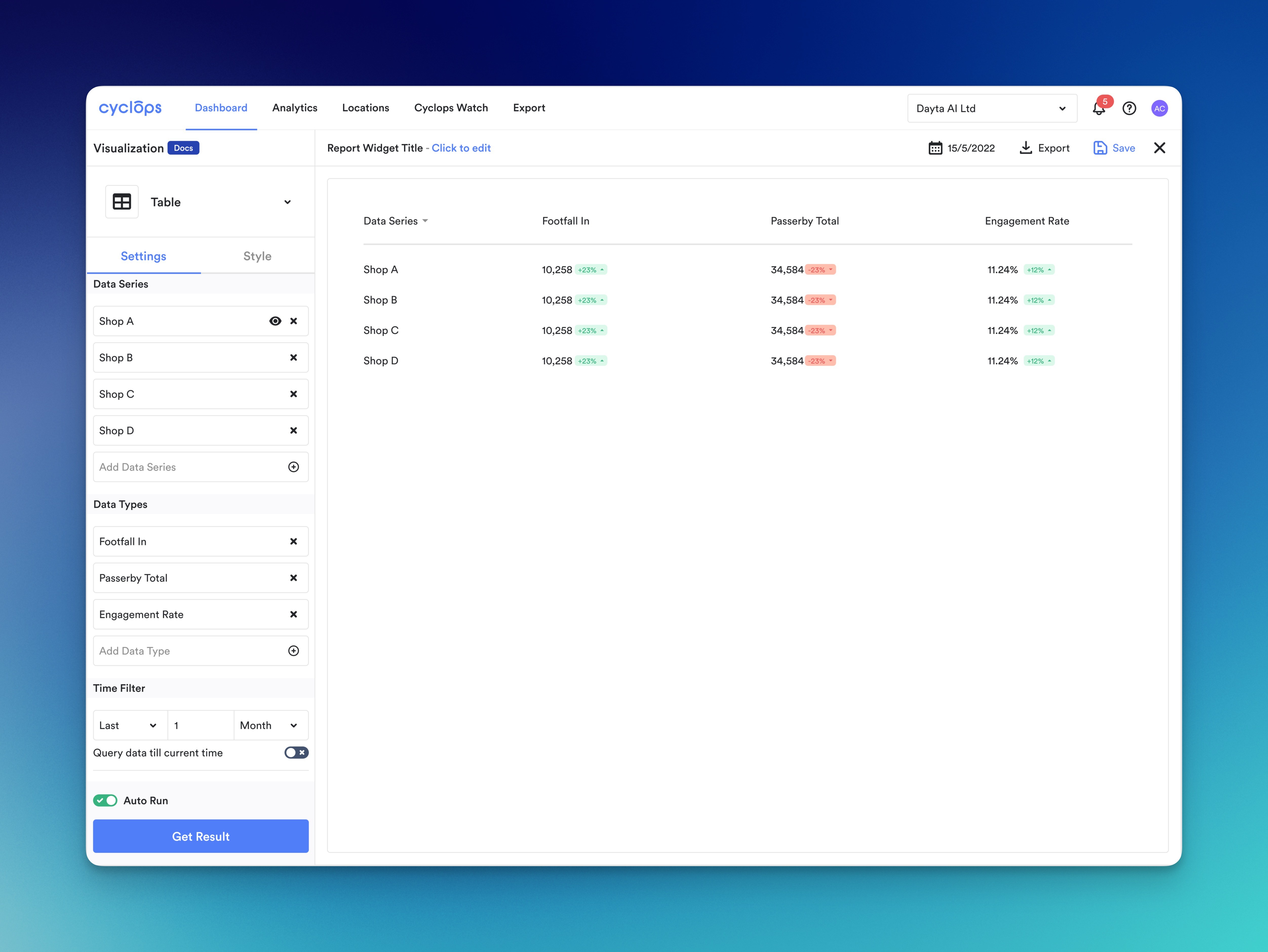
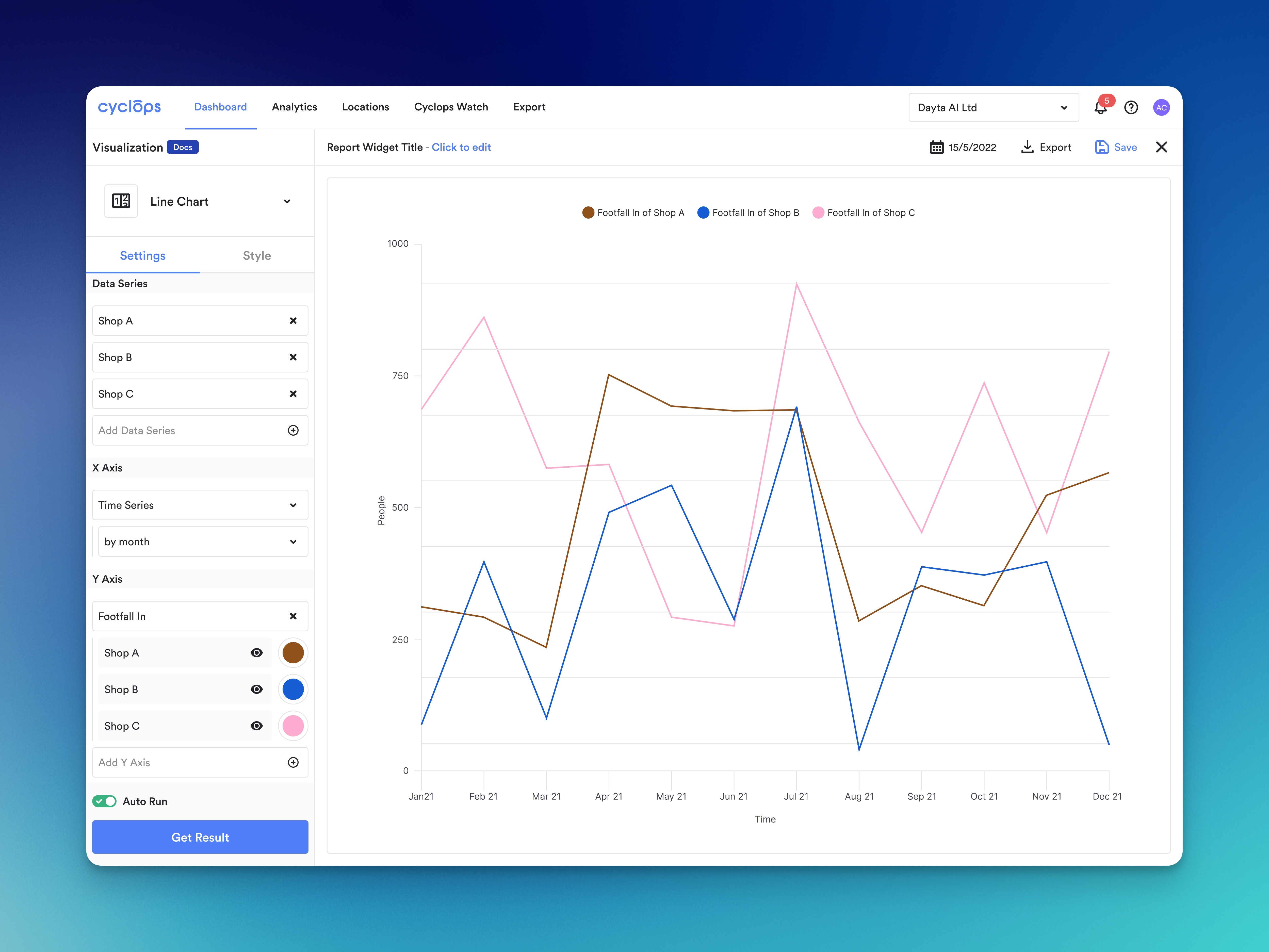
I also realised that data visualisation would be central to the redesign. I focused on making complex data digestible, using clear and digestible charts and graphs that empowered users to make quick, informed decisions.
User Experience (UX) Enhancements
I took a user-first approach to enhancing the overall experience. Some of the key features I introduced include:
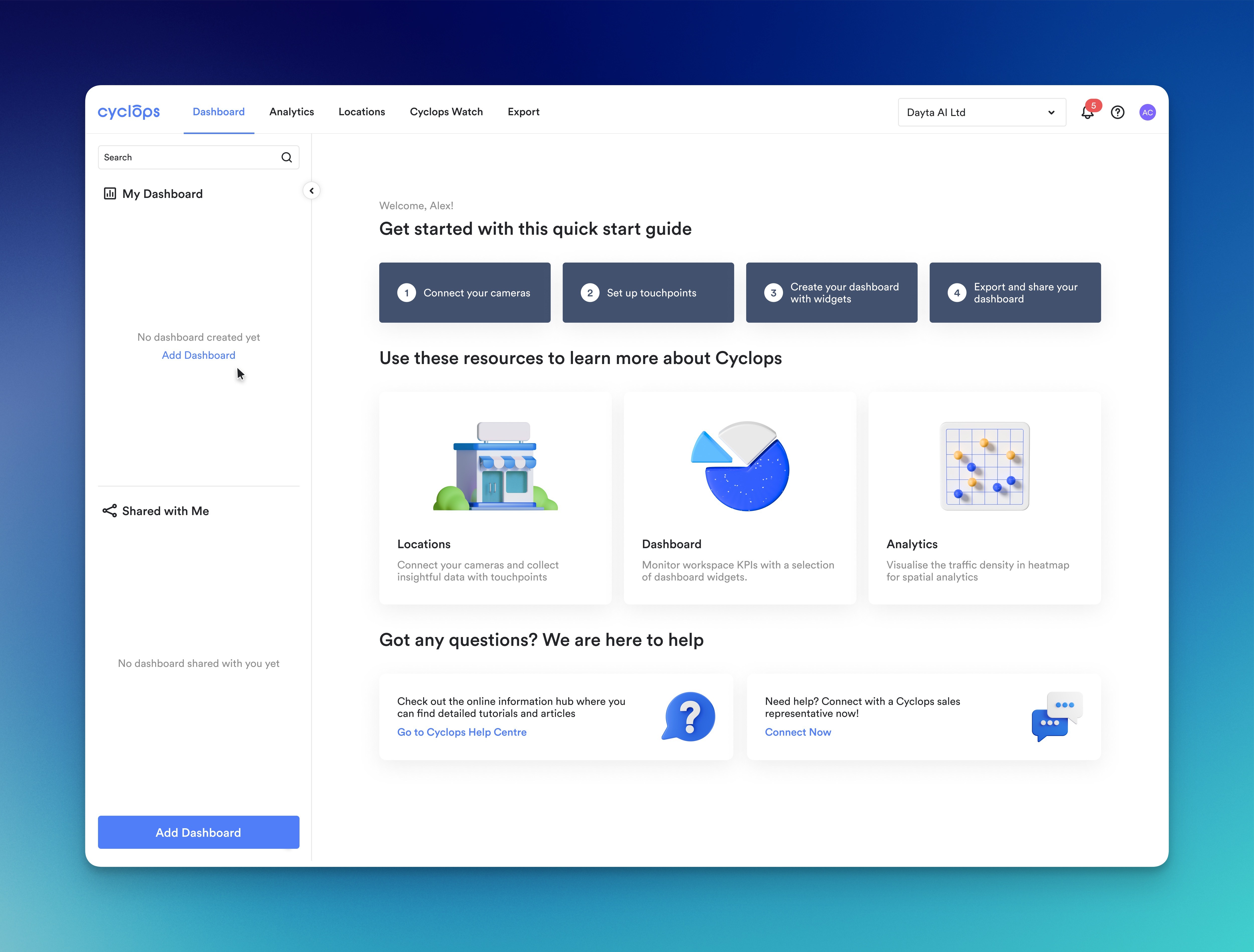
Customisable Dashboards: Users could now tailor their dashboards to display the most relevant data for their roles. This gave both Retail Manager Rebecca and Data Analyst David the flexibility to see what they needed when needed.
Streamlined Camera Integration: By simplifying the camera setup and management process, we reduced the technical barriers, making it easier for users to get started.
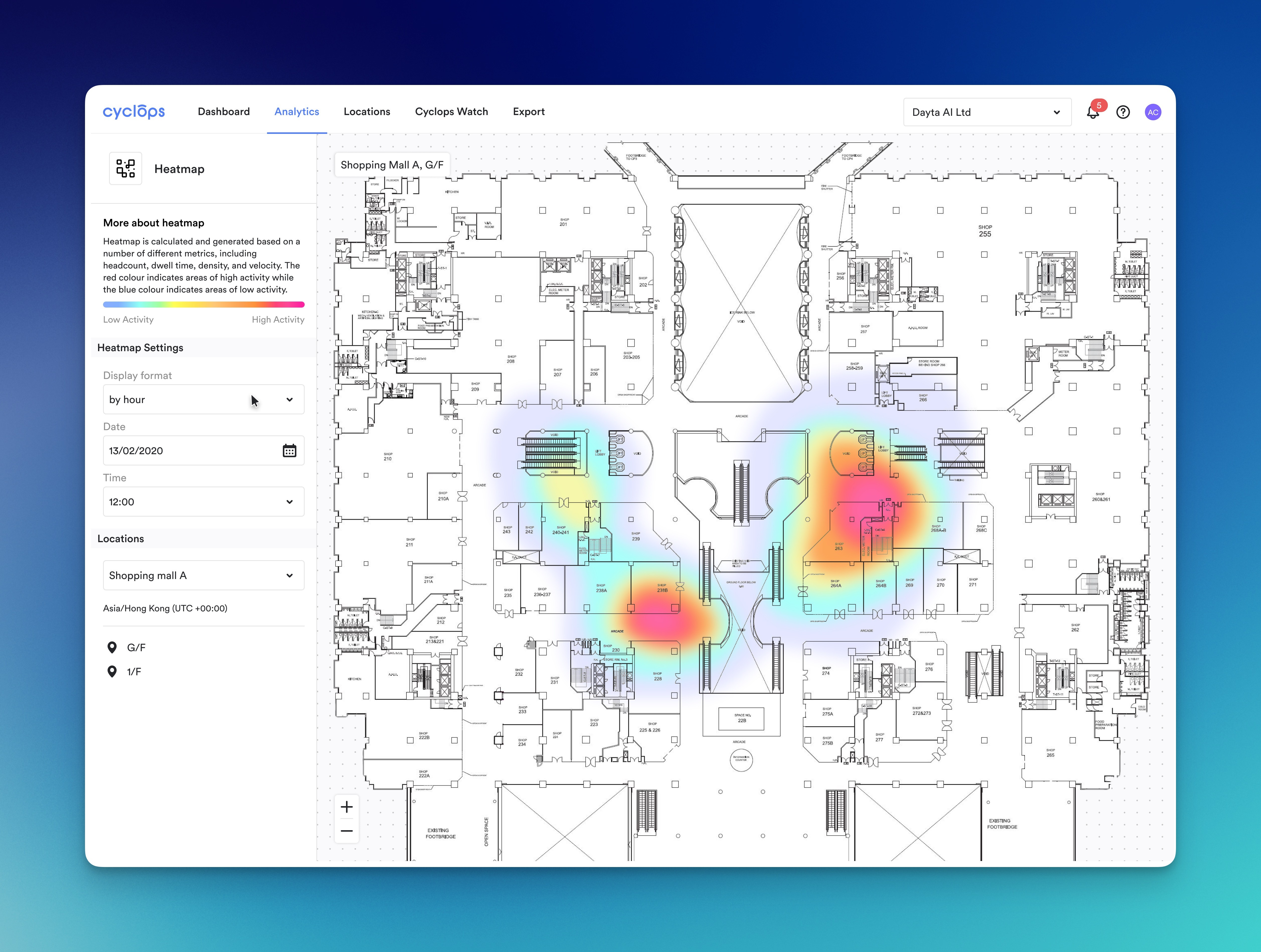
AI-Powered Insights: I integrated AI-driven insights, enabling the platform to provide real-time, actionable data without manual analysis. This feature significantly sped up decision-making and allowed users to focus on strategy rather than data wrangling.
Design System Creation
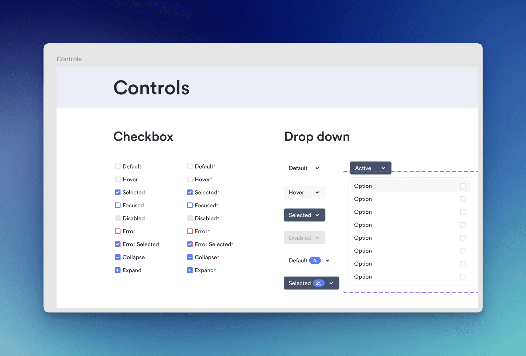
To ensure consistency across the platform, I developed a design system. This included reusable UI components, standardised typography, colour palettes, and guidelines that would be used for future iterations. This system created a scalable and cohesive design language that could evolve with the platform.
Testing and Iteration
Usability Testing
I’m a strong advocate of iterative testing, and usability testing was a cornerstone of the redesign. I led multiple testing rounds with retail managers and data analysts to ensure the platform worked for everyone. These sessions provided invaluable feedback, and with each round, we refined the user interface and workflows to ensure the platform was genuinely intuitive and met the needs of its users.
Collaboration with Developers
I worked closely with the development team throughout the process to ensure a smooth design-to-development handoff. Regular reviews and a clear documentation process ensured the final product stayed true to the design vision. My role wasn’t just about designing; it was about making sure that what we designed worked in practice once it was developed.
Final Deliverables
In the end, the final deliverables included:
High-fidelity interactive prototypes: These served as a detailed guide for the development team, ensuring a seamless implementation.
Design guidelines: I delivered comprehensive design specifications that would maintain consistency across future platform iterations.
Onboarding materials: I created onboarding materials to ensure that users could quickly become familiar with the new interface, improving user adoption.
Post-Launch Optimization
Once the platform launched, I continued to track how users interacted with it, using data analytics to drive post-launch optimisations. This included further refinements to dashboard customisation features and improvements to the data insights interface based on real-world user behaviour. This iterative approach ensured we were constantly improving and responding to user needs.
Results and Impact
The results were immediate and significant:
25% increase in user engagement, thanks to the intuitive interface and improved navigation.
30% reduction in time spent analysing data, allowing users to make decisions faster.
15% growth in platform adoption, as the new design made it easier for users to get started and stay engaged.
Key Learnings
Stakeholder Alignment: Collaboration with DAYTA AI stakeholders ensured that our design met business and user needs.
Simplifying Complexity: By simplifying complex processes, we created a powerful and easy-to-use platform.
Iterative Design: Regular feedback and iterative improvements were essential to delivering a product that resonated with users.
Conclusion
As the Lead Product Designer on the CYCLOPS redesign, I took full ownership of the process, from defining the initial problems to delivering a product that exceeded user expectations. This project showcased the power of user-centred design, iterative improvements, and close collaboration with stakeholders and developers. The result was a platform that simplified complex data and empowered users to make quicker, more informed decisions.